Friday, November 22, 2013

Sentiment Update:

Since it’s become quite popular among analysts and pundits in the business press to talk about equity market bubbles, especially in the US, we thought it would be useful to quickly review several sentiment indicators to gauge how “bubbly” this market truly is.  While we’ll agree that US markets are trading above historic valuation levels using longer-term valuation metrics, we still aren’t seeing the frothy, super-bullish sentiment across the board that usually accompanies massive market tops.  Instead, many of the indicators we follow remain in neutral territory.  Moreover, there still seems to be a pervasive underlying skepticism among institutional and individual investors.  Over the past several months, for instance, minor market corrections have been accompanied by strong upticks in negative/bearish sentiment.  With sentiment operating as a contrarian indicator, this is a good sign that there’s still fuel in the market tank.  Ultimately, we’ll get worried about market prospects when we see high valuations joined hand in hand with excessively bullish sentiment readings.  Until then, we don’t see many reasons right now to believe markets can’t sustain a continued grind higher with normal back-and-fill corrections along the way.

Now, let’s look at a few of the indicators.

CBOE Put-Call Ratio

On the one hand, the CBOE Put-call ratio’s 10-day moving average (lower ratio indicates fewer puts traded relative to calls, hence more bullishness), is trading at the lowest levels observed since last fall right before the November 2012 correction and sits on the lower side of the range observed over the past few years.  On the other, the put-call ratio’s 10-day moving average is hovering near the average going back to 1995.  At 0.83, the current level is approximately 0.3 standard deviations below norm, maybe a touch on the bullish side, but far from extremes. 


ISES Sentiment Indicator

This is another indicator that attempts to capture the relationship between trading in calls and puts.  In this case, the lower the number, the more bearishness (i.e. put trading outpaces call trading) in the marketplace.  Like the CBOE number, we see sentiment has moved towards the most bullish levels since fall 2012.  Nonetheless, sentiment has only reached the historic mean, like the CBOE indicator.  Sentiment in this indicator remained quite bearish for the past year and a half; remarkably, bearish levels at points in 2012 have matched levels seen during the worst days of the financial crisis in ‘08/’09.  Perhaps the fact sentiment has languished in the bearish depths much of the past year suggests there’s some stored up energy for additional market gains.


Individual Investor Sentiment

Market watcher and technician Bob Farrell devised an index based upon the Bull, Bear, and Neutral numbers in the weekly AAII Bull/Bear survey.   Under his methodology, sentiment becomes too bullish and the market becomes overbought when the 10-week moving average moves above 1.50 or too bearish and oversold when it falls below 0.50.  Currently, the 10-week moving average is 1.01, dead center of the range.  Like the two indicators above, sentiment has moved from very bearish levels in prior months back to a neutral posture and are nowhere close to levels associated with potential major dislocations.  


In the past major market declines have been associated with a combination of high valuations, extreme sentiment, consistent across all indicators, in the months leading up to market declines, declining market momentum indicators, and significant deterioration in leading economic indicators.  Right now, valuation is elevated.  But, sentiment is neutral, momentum is solid, and leading economic indicators are showing a very low probability for recession in coming quarters.  Again, until we see a significant uptick in sentiment accompany extreme valuation and the prospect for economic dislocation, we’ll maintain a constructive posture, understanding that corrections along the way are quite normal and healthy.

Friday, November 15, 2013

Sector Valuations

In the past, we’ve spent time in this space looking at overall index valuation levels for country level indices around the world.  After looking at US GDP aggregates last week, it occurred to us that looking at long-term P/E ratios by sector for both the S&P 500 and the MSCI World may give us additional insight into where the markets have been and where they might pivot in coming years.  

As with past valuation exercises, we prefer to use normalized 10-year trailing P/E ratios to eliminate much of the short-term noise in the data associated with short-term earnings cycles.  This has been particularly important in recent years considering the high level of earnings volatility that’s been observed at various points over the past decade.  Our sector level earnings data comes from Bloomberg.  In the case of the S&P 500 sectors, data in Bloomberg goes back to 1991, allowing us to construct ratios from 2001 forward.  For the MSCI World, sector data goes back to 1995 allowing us to begin in 2005.  

First, let’s look at valuation in table form:

S&P 500 Sector P/E Ratios
Overall S&P 500
22.8
Consumer Discretionary
34.5
Information Technology
27.9
Consumer Staples
26.7
Health Care
24.6
Industrials
24.1
Materials
22.5
Telecom Services
20.4
Utilities
17.4
Energy
17.0
Financials
14.7
*Bold Italics: above trailing 10-year avg. P/E

MSCI World Sector P/E Ratios
Overall MSCI World
21.0
Consumer Discretionary
30.8
Information Technology
28.1
Consumer Staples
26.9
Health Care
25.3
Industrials
23.4
Telecom Services
21.2
Materials
18.5
Utilities
16.0
Energy
14.7
Financials
13.4
*Bold Italics: above average P/E since 2005 (bgn of data)

Last week when looking at the expenditure components of GDP, we noted that the high level of consumer spending relative to historical averages might bode poorly for the consumer related market sectors’ future performance.  Looking at valuation levels above, we see that Consumer Discretionary is trading comfortably above 30x in the S&P 500 and above 30x in the overall MSCI World index as well.  The Consumer Staples sector isn’t far behind either, coming in as the third highest valuation sector in both indices.  Granted, the data series we have access doesn’t go back terribly far, but Consumer Discretionary is trading nearly two standard deviations above the average valuation of the past decade.  

On the flip side, the Financials and Energy sectors hold the bottom spots in both the S&P 500 and the MSCI World and remain well below the overall averages for the index.  Financial sector stocks remain far below the former peaks.  The Financial sector indices were obliterated during the financial crisis.  Valuations fell below 5x in the S&P 500 and just above 5x in the MSCI World.  While the energy sector indices are moving closer to all-time highs, valuations remain compressed because normalized earnings have been able to keep pace with stock prices.  

The Information Technology sector is very interesting.  In the MSCI World and S&P 500, IT holds the 2nd spot in terms of highest valuation even though prices for the sector indices remain far below the peaks achieved in the early 2000s.  The tech sector in the S&P 500 remains 43% below the peak price level from the early 2000s!  At the beginning of the data series (the last gasps of the tech boom), IT was trading over 100x normalized earnings in the S&P 500!  Even with the collapse in price and strong growth in the normalized earnings figure over the past decade, valuations remain close to 30x.  A decade later, IT is still working off the massively excessive valuations.  IT shows the perils of investing in stocks priced to infinity and beyond!

Health care is another sector that bears watching.  Valuation is closer to the top of the current tables.  Yet, like IT, Health Care traded at nosebleed valuations a decade or so ago meaning that the 12-year chart of Health Care P/Es shows compression over time.  Health Care companies have obviously benefitted from the aging of developed world populations, development of new health care technologies, and other factors.  Future demographics are very favorable as well.  It appears much of this optimism remains priced in, however.  In the both the S&P 500 and MSCI World, the Health Care sub-index prices are approximately 50% above levels observed before the economic crisis.  It may be a much tougher row to hoe from here on out; multiples could resume their march down and to the right of the valuation charts.  

Wrapping up, the consumer sectors appear especially overvalued and the probability remains high for subpar equity performance out of these sectors in coming years.  Info Tech has worked off significant excess over the past twelve years, but remains vulnerable to multiple compressions.  Health Care is another sector that appears vulnerable over the next several years.  Alternately, financials and energy multiples remain far below broader index multiples and the multiples for other sectors, suggesting they may carry the water for the broader indices in coming years.  

Below, we’ve included all of the charts for the individual sector P/E ratios.

World Sector P/E Charts:


S&P 500 Sector P/E Charts:


Friday, November 8, 2013

A Look at the Numbers: Real GDP Edition

With the release of the Q3 US GDP report this week, we realized it had been a while since we’d looked at some of the underlying components of GDP to get a sense of the general economic trends at home.  In this case, we’ll use the “expenditure” based approach; this methodology adds Consumption, Investment, Net Trade (negative subtracts, positive adds), and Government Expenditures to come to a total GDP number.  This works for nominal (not adjusted for inflation) and real GDP (adjusted for inflation) numbers.  As always, a quick, broad overview of these aggregates provides an interesting picture on recent trends in the US, perhaps gives us a picture of the future sources of US growth, and upends a few nuggets of conventional wisdom along the way.

Now, here are the charts for the four underlying categories.  We used the real, inflation-adjusted numbers for all series, and begin in 1997, as there were a few data inconsistencies as we went beyond that point.  These charts show each category as a percentage of overall real GDP.  
Right off the bat, we’re struck by the sharp rise in real consumption as a percentage of GDP from the late-1990s, which coincided with a sharp deterioration in the trade balance.  This makes sense as the sharp rise in personal consumption coincided with a sharp decline in the savings rate.  A declining external trade balance is very much reflective of declining national savings.  Since the crisis, consumer spending has leveled off relative to overall GDP since the beginning of the Great Recession.  Still, it’s amazing how well the series has held up all things considered.  

Investment, on the other hand, took the brunt of the pain prior to and during the Great Recession and Financial crisis, falling significantly relative to overall real GDP.  From Q4:2006 through Q4:2009, real investment experienced unrelenting negative year over year prints—13 straight quarters of year over year declines!  Q1, Q2, and Q3 2009, during the worst days of the recession, year over year real investment was down 23%, 26%, and 25%.  Since then, investment has rebounded decently and is now getting closer to levels observed prior to the crisis in terms of its relationship to overall economic growth.  Since Q1:2010, there have been six quarters out of 15 with double digit year over year investment gains.  Combine the improvements in investment with the improvement in the trade balance, and we get a sense that the overall national savings rate has increased a decent amount.

Which brings us to what is perhaps the most interesting chart of the four, that of US government expenditures, which includes expenditures at all levels of government.  This is where conventional wisdom gets turned on its head.  Read the news and listen to the arguments among politicians, and one would assume that government spending run amok dominates the GDP aggregates.  Not so.  Actually, government expenditures are easily at the lowest point relative to overall real GDP observed in the past two decades.  If we broaden out the data series to 1947, the current level of government expenditures relative to overall real GDP is at its lowest point in the post-war era.  As you can see in the chart, the level of government expenditure relative to overall GDP spiked during the recession as automatic stabilizers and the stimulus kicked in.  Since then, the US has experienced its own mini-version of European style fiscal austerity.  Of course, we focus entirely on Federal government spending, but keep in mind that state and local government spending has been hit hard in many cases.  Counterintuitively, this seems to explain a good bit of the improvement in national savings.  Government at all levels has made the big adjustment on a relative basis, not the US consumer.  Since Q1:2009, average year over year quarterly real government expenditures comes to -0.54%.  The year over year print has been negative in 12 out of the last 13 quarters.  In the most recent quarter (Q3:2013) real government expenditure was -2.77% year over year.  

Keeping with the theme of upending conventional wisdom, here is the breakdown of average year over year real government spending prints for all presidential administrations going back to Eisenhower:

Obama:                -0.54%
GW Bush:               2.30%
Clinton:                  1.26%
GHW Bush:       1.95%
Reagan:                  3.35%
Carter: 1.98%
Nixon/Ford: 0.06%
Kennedy/Johnson: 5.02%
Eisenhower: 1.07%

Again, government expenditure numbers account for total expenditures at all levels, but with the Federal government accounting for the bulk of the overall expenditures, it creates some interesting food for thought.

Wrapping up, there are several things to take note of.  First, since 1947 average year over year real GDP has been 3.26%.  The average since the beginning of 1990, however has only been 2.48% and since the beginning of 2000, it’s been a paltry 1.92%.  Clearly the US capacity for growth has downshifted over time.  Since Q1:2010, we’ve seen 7 out of 15 quarters with sub-2% year over year real GDP growth, including the last four quarters.  It’s easy to see why many economist types and Federal Reserve officials are worried about slow growth, output gaps, deflationary potential, and other bugaboos.  Second, while the old cliché posits that you should never bet against the American consumer, we’d guess that going forward consumption has reached a ceiling relative to overall GDP growth.  At best, we’d expect mediocre real consumption growth going forward.  Worst case, consumer oriented sectors could feel some pain, at least relative to other sectors like industrials, as there seems to be opportunity for investment to continue to increase.  Interestingly, among the subsectors in the S&P 500, the Consumer Discretionary subcomponent is trading at the richest valuation among all sectors; normalized P/E is now approaching 30x, and it’s now at the highest level observed since early 2000.  Finally, as the fiscal position of state and local governments improves gradually with the overall economy, we’d imagine that government expenditures will pick up and the overall series will stabilize relative to overall GDP.  The Federal government remains a wild-card.  Finally, we can use Investment + Net Exports as a quick proxy for national savings; this number was in steady decline from 1997 to and through the financial crisis.  Since then the number has improved back to levels last seen at the beginning of the 2000s.  We expect the trend to continue.

Friday, November 1, 2013

Treasuries and Future Equity Market Volatility

What, if anything, can yield spreads between the 3-month T-Bill and the 10-Yr Treasury bond tell us about the future path of equity market volatility?  Quite a lot, actually.  

Using monthly historical data on 3m/10y spreads and the VIX going back to September 1992, there is a decent inverse statistical relationship between the spread level in a given month and the level of equity market volatility approximately two years later.    

Why would this occur?  Generally, Federal Reserve interest rate policy decisions operate with a lag of one and half to two and a half years.  Wide spreads, i.e. much lower short rates compared to the long end of the Treasury curve, are generally associated with accommodative Fed policy.  With a lag, one might expect economic activity to pick up 18 to 24 months after the policy shift.  Low short rates and wide spreads influence credit creation, the life-blood of an economy, in various ways.  Borrowers may be more apt to borrow with lower overall rates.  With spreads wider, banks and others may be more encouraged to supply credit.  The converse is also true.  Hikes in the target Fed Funds rate over time are meant to dampen animal spirits and keep inflation tamed.  Historically, the Fed has often moved short rates to a point where shorter rates on the Treasury curve actually exceed the level of rates at the long-end, a condition known as an inverse yield curve.  Many prognosticators actually point to inverse yield curve situations as a reliable recession forecaster.  Historically, various leading indicator indices have factored yield spreads into their calculations.  Coming back to equity market volatility, periods of economic calm have generally been associated with equity market calm, while recessions, or serious decelerations in economic activity often cause serious market dislocations.  

What does the historical data tell us?  Statistically, the relationship between the VIX, an index constructed to represent implied volatility in S&P 500 equity index options (higher VIX levels indicate higher implied volatility and vice versa, hence its nickname, “The Fear Index”), and 3m/10y Treasury spreads is reasonably strong when using a 23-month lag.  The correlation between the two over the past two decades is -0.605 and the R-squared is 0.37.  Higher Treasury curve spreads have resulted in lower equity market volatility two years later and vice versa.  

What about the current situation?  The current monetary policy situation in the US makes the kind of Fed cycle rate cycle analysis referred to above somewhat more problematic.  Since the beginnings of the financial crisis and Great Recession, the Federal Reserve has kept the Fed Funds rate near zero.  The Fed can’t take the official Fed Funds rate negative, so the Fed has used unconventional policy such as quantitative easing (buying lots and lots of longer duration Treasuries) to keep rates tame on the longer end of the curve, ostensibly to encourage borrowing activity and general credit creation.  As a result, shifts in the Treasury curve spreads have been more influenced by moves in the 10-year Treasury yield.  Interestingly, except for the volatility flare-ups associated with the European credit crisis, an exogenous shock to the US markets, equity market volatility has acted very much in line with what Treasury spreads would have predicted over time.  Since 1992, the overall average 3m/10y spread is 1.76% and the average VIX value is 20.4.  From March 2009 to November 2011, the period of spread values that captures VIX values to the present time period, the average Treasury 3m/10y spread has been 2.98%, far above average (steeper yield curve, should produce lower volatility).  The lagged VIX average corresponding to that Treasury range through month-end October 2013 has been 19.1.  The median, which reduces the influence of the outliers associated with the European flare-ups, is 17.1.  Since early 2009, US markets have risen, and the path of volatility has been downward, conditions that have been associated in the past with steeper yield curves.

What do Treasury spreads in recent months potentially tell us about the future path of volatility?  Beginning in late summer 2011, 3m/10y Treasury yield spreads began moving downward reflecting the sharp move downward in the 10-year Treasury yield.  While many would ascribe the move in the long-bond to QE, the overall move was probably much more related to market worries about the future path of economic activity.  Between 12/30/2011 and 4/30/2013, the average Treasury yield spread was 1.69%, slightly below the long-term average.  The 12/30/11 spread value corresponds to the November 2013 VIX value and the 4/30/13 spread value corresponds with March 2015.  The VIX closed October at 13.75, very low historically.  The average predicted VIX value for the 18-month period from this point forward is 21.23.  If the model holds up, it may be time for equity investors to get prepared for normalization in equity market volatility over the coming year or two.  This doesn’t mean that the equity markets are necessarily prepared to fly off the rails, or that the economy is prepared to collapse—again predicted vols are more in line with the historical average—it just means that the benign, boring market environment we’ve become accustomed to in the US has the potential to move back towards choppier waters in 2014.  

Friday, October 25, 2013

Rule of Thumb: Valuation Edition

A little over a year ago, we wrote about a simple “rule of thumb” calculation that Vanguard founder Jack Bogle has discussed in order to quickly predict 10-year future annualized market returns.  With markets having rallied significantly over the past 12 months, we thought it might be interesting to quickly run back through the "back of the envelope" calculation and see what it’s telling us about return prospects over the next decade in US and global markets.  Then, we’ll look briefly again at a few other US-focused valuation indicators to see how the "back of the envelope" calculation lines up with those that have a long statistical history.  

The Bogle Rule, as we’ll label it, states that one can approximate annualized future 10-year market returns by adding together predicted annual nominal GDP growth and the dividend yield at the start of the period, then adding or subtracting an annual percentage based upon the distance of current P/E valuation from the historical average, thus accounting for multiple expansion or contraction. The expansion/contraction factor is calculated "back of the envelope" by dividing the percentage distance from the median by 10.

Here’s a quick and dirty example.  If nominal GDP growth (GDP growth not adjusted for inflation) is expected to be 5% per annum, the current S&P 500 dividend yield is 2.5% and the market happens to trade 20% below median, expected annual total returns over the subsequent decade would be 5% + 2.5% +2%, or 9.5%.  

How do things currently stack up right now in the US and among the major international equity indices?

For the US, we’ll go with 2.5% real GDP growth over the next decade per year, and 2.5%, giving us approximately 5% nominal GDP growth.  The current S&P 500 dividend yield is 2%.  Using the Shiller long-term 10-year P/E, US markets are currently overvalued.  The current P/E is 24.3x vs. the long term median of 16.5x.  The P/E would have to contract by 32% total to get back to median levels.  We’ll lop off 3% per year from the "back of the envelope" calculation for multiple contraction.  5% + 2% - 3% gives us an annualized total return calculation of 4%.

Across the broader EAFE, which encompasses developed economies in Europe and Asia, we’ll assume slightly lower economic growth and inflation prospects than the US due to structural economic issues and assign a value of 4% for nominal GDP growth.  The current dividend yield for the MSCI EAFE Index is 3%.  The MSCI EAFE is currently trading at 19.1 approximately 13% above the long-term median.  We’ll remove 1% per annum for multiple contraction.  The back of the envelope calculation comes in at 6% per annum.  

Turning to the MSCI Emerging Markets Index, we’ll assign slightly higher values for real GDP and inflation than the US and give the emerging markets roster a 6% per annum nominal GDP forecast.  The MSCI Emerging Markets Index’ current dividend yield is 2.6%.  Furthermore, the index is currently trading at 15.6x, approximately 6% below typical long-term median equity market valuation.  As such we’ll add 0.5% per annum for multiple expansion.  Overall, the back of the envelope calculation comes in at 9.1%.  

Surely, these assumptions could be wildly off the mark.  Therefore, as a point of comparison, let’s compare the US numbers to predicted US values derived from two valuation metrics with a long standing statistical backdrop, the Shiller P/E and the Q-Ratio.  

As mentioned above, the current 10-year P/E for the S&P 500 is 24.3x.  At the current levels, the predicted value of nominal total 10-year future annualized S&P 500 returns is 5.3%, below the long-term median 10-year annualized return of 9.1%.  The Q-ratio, which is basically an approximation of the traditional Price to Book ratio using market book values, stands currently at approximately 1.00.  At the current level, predicted 10-year annualized nominal total returns come in at approximately 4%, in line with our simple prediction above.  

Keep in mind that the statistical relationships between the Q-ratio and Shiller P/E and future 10-year market performance are reasonably strong.  Correlation for the Q-ratio and returns is -0.72 (the negative correlation tells us that higher valuation produces lower returns and vice versa).  Correlation for the Shiller P/E is -0.68.  

Overall, it doesn’t appear that our back of the envelope prediction for the US is outlandishly off the mark.  Take all three indicators, two of which have a strong statistical history, and we think it’s safe to say there is a high probability future S&P annualized returns will come in decently below the long-term average of 9.1%.  On the other hand, international markets, especially emerging markets, seem to be positioned for better 10-year annualized returns from this point in time.  

Valuation and the potential for multiple expansion or contraction play a big part in these forecast differentials.  Multiple expansion and contraction have always figured prominently in long-term return outcomes.  It may take a while sometimes, but eventually investors must reckon with reversion to the mean.

Again, and we can’t emphasize it enough, 10 years is a long time and markets don’t move in neat straight lines.  Nor does over or undervaluation mean that markets will begin moving in the short-term.  Take October 2003.  At that time, the Shiller P/E stood at a more overvalued 25.7x, with a predicted annualized total return per annum of 4.7% over the ensuing 10-years.  Total annualized returns came in at a better than predicted 6.8% per annum (still approximately 2.5% per annum below the long-term median).  As we all know very well, the market movements that transpired over that 10-year period were very messy (to put it kindly).  From that overvalued position in October 2003, markets continued to rally for another four years before dropping a harrowing 60% in 2008 to 2009, only to rally sharply from the March 2009 lows to the present.  

It’s better to think about these long-term prognostications with a generalist perspective.  In the US, if you’re thinking about planning for retirement or your child’s college education in 10-years, it’s probably not smart to assume that we’re on the verge of a 1980s/1990s super-bull performance repeat.  Alternately, for the doom and gloomers of the world, don’t necessarily count on massive market carnage; there’s a good chance that the market produces decent, if unexceptional, returns. 


Friday, October 18, 2013

It’s the economic data, Stupid! Or, wait, is it??


Turn on any financial, news, or political program in America, and inevitably hosts and guests will spend a good portion of the time discussing economic growth and its relationship to market performance.  Of course, all of us got an extra helping of this type of analysis while the budget shutdown was in force, with the general theme being that governmental infighting will hold back the economy, and in turn, the ability of the S&P 500 to reach new highs this year.  

In practice, a historical statistical relationship between market performance and GDP growth is non-existent in many cases.  Comparing annual S&P 500 returns with annual US nominal and real GDP figures from 1950 through 2012 produces some interesting results using simple regression analysis.  Here’s a quick summary of the results:

  • From 1950 to 2012 using annual data, there is basically no statistical relationship between yearly real and/or nominal GDP and S&P 500 performance (correlation coefficients of -0.05 and 0.11, real and nominal)
  • Likewise, there is very little if any statistical relationship between trailing 10-year compounded GDP (nominal or real) growth and 10-year trailing S&P 500 returns (correlation coefficients of 0.21 and -0.23, real and nominal).  
  • There isn’t a statistical relationship between GDP in a given year and S&P performance in the following year, nominal or real.
  • There is, however, a decent statistical relationship between S&P 500 performance in a given year and real GDP growth in the subsequent year.  This relationship did not hold up when running the analysis with nominal GDP numbers (correlation coefficient of 0.63 using real GDP, but only 0.19 using nominal).  

Here are the basic numbers:


What are some of our quick takeaways from this simple statistical run?

  • Making investment decisions based upon current or prior economic data is probably a waste of time (and opportunity).  Certainly many prior studies have demonstrated this, but it never hurts to repeat.
  • Equity markets seem to be a decent discounting engine when it comes to future economic growth.  Markets seem to get ahead of the data on economic growth.  This brings us back to point one.  Bottom line: if you’re waiting to see the whites of the economic data’s eyes before making a decision, you’re probably going to be late to the party.  
  • With an R-squared value of 0.395 (which basically says that S&P 500 performance “explains” approximately 40% of next year’s GDP), that leaves a lot of room for other variables like valuation or interest rates.  Our gut feeling here is that even if one has particularly accurate predictive capacity on GDP growth in future years, the investor with that information could still end up with a poor investing outcome, all things being equal.  Short-term market decision-making based upon predicted future economic outcomes alone is probably a losing proposition for most investors.
  • We do know that statistically, 10-year CAPE P/E values have a decent statistical relationship to 10-year future annualized market returns.  Soaking it all in, an investor is much better off paying attention to general valuation levels and their potential impact on future returns than wringing hands over economic data releases, especially when valuations reach extreme levels (perhaps greater than 25x on the overvaluation side or less than 10x or 12x for undervaluation).  Of course, the longer term view and patience is essential when it comes to using valuation.  Overall, enjoy your days and don’t let the latest BLS release on employment or the latest government GDP release ruin your day or month.  It does make for good water-cooler talk and keeps the TV talking heads in business, though.
  • If the market is a decent discounting mechanism and moves ahead of the data, not with it, and one is concerned about managing downside risks, it might behoove those interested in risk management techniques to explore employing simple longer-term technical trading rules, such as simple moving average triggers.  As discussed in the past, some intermediate to longer-term moving average rules have produced solid historical outcomes from a risk-adjusted return basis.  The market as a whole knows more than we do individually.  If markets are showing signs of breaking down, it’s often not wise to fight the tape.  The same can be said for rising markets, as demonstrated in recent months and years.  
  • Ultimately, the market doesn’t care about our theses based on current or backward looking information and makes mince meat out of those stuck in the analytical gobbledygook.  Many investors were blindsided in ’08 looking backward and accepting the “all is well” economic news at the time.  Likewise, many investors have missed the current rally hung up on economic and political news flow.  Odds are the next market calamity, like the prior ones, will only become truly apparent in hindsight.  And, like the past, most investors will end up selling at precisely the wrong moment by using real-time economic data (and by paying attention to the talking heads in real time).

Friday, October 4, 2013

Valuation Update:


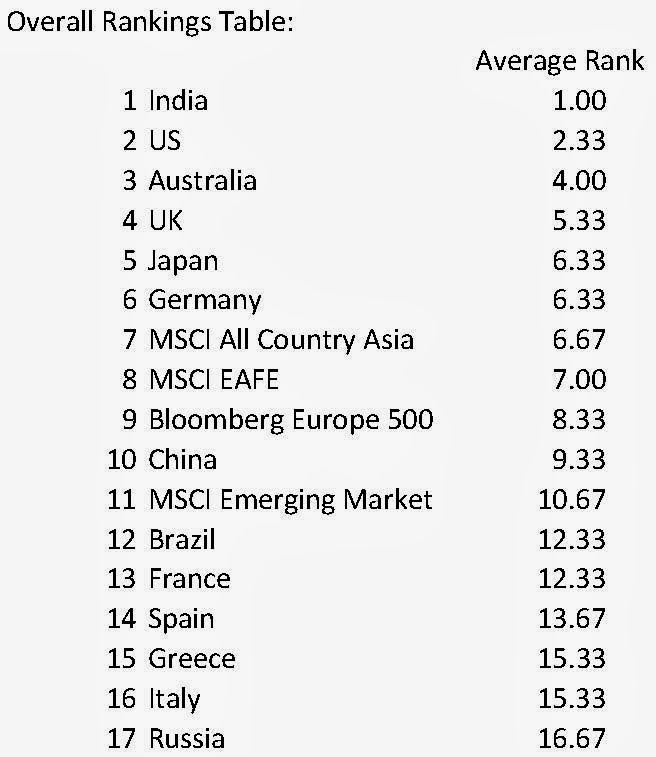
Once again, it’s been a few months since we updated our valuation tables.  As in the past, we’ve included stock market indices for 13 countries across the developed and emerging market spectrum.  We also throw in a few developed and emerging market indices to show how the broader international areas/regions stack up against one another.  We take three indicators broadly used by many value-oriented practitioners—10-Year CAPE P/E, Price to Book, and Enterprise Value to EBITDA—rank the countries in each category from highest valuation (relative overvaluation) to lowest valuation, then average across the categories to provide an overall score to determine position.  The lower the average score, the higher the relative overvaluation and vice-versa.  All ratios are based fundamental data provided by Bloomberg.

Here are updated results as of 10/4/13:


Valuation Conclusions:
  • While the overall MSCI Emerging Market index has taken a relative beating this year, reflected in the fact that the MSCI Emerging Market Index sits in the lower portion of the table, India remains the most overvalued across all three indicators on a relative basis.  Among the BRIC country indices, the India SENSEX Index has held up reasonably well over time.  Brazil, Russia, and China indices are all decently below 2008 highs, but the SENSEX has held its ground, even though overall economic and market prospects have become cloudier.  Perhaps the valuation tables above indicate that Indian markets will play catch up and pay a price over the next several years in terms of poor relative performance.
  • The US comes in at a close second to India in terms of relative overvaluation.  We’ve discussed in past valuation posts and in our chartbook that historical analysis shows that future 10-year total annualized returns for the US are predicted to fall three to four percentage points below the long-term historical average per annum.  Australia, UK, and Japan round out the top five portion of the table when it comes to individual countries.  Japan has witnessed a phenomenal run over the past year on the back of the Abenomics announcements.  Fundamentals are going to have to start catching up, though, for momentum to continue.  Japanese markets have basically moved sideways over the past five to six months and momentum is waning.  Australia benefitted mightily from China’s growth over the past decade.  There could be a moment of truth for Australian investors as markets adjust to new realities about China’s future economic path.  The UK has rallied in recent years, but equity market prices have remained ahead of broader economic realities.
  • Within the developed market category, France, Spain, Italy, and Greece continue to occupy the bottom spots, ex-Russia.  Valuations have recovered off the rock-bottom levels observed during the main portion of the European crisis.  Still, markets continue to price in significant pessimism.  These markets have a strong chance of providing outsized relative returns over the next decade, if history is any guide.  Economic momentum is beginning to turn in the periphery countries.  Like an individual value stock, all it takes is a few better than expected economic surprises to attract investor capital into the vacuum.  
  • Looking at the broader indices, the MSCI EAFE, representing developed markets ex-US, scores better than the United States, while the Emerging Markets Index remains the most attractively valued on a relative basis.  Breaking down regional international indices, Europe scores better than Asia. 
  • Russia continues to occupy the bottom of the table.  Like the broader Emerging Markets Index, Russia’s equity markets have basically treaded water since 2006/2007 performance wise.  Nonetheless, Russia has rarely been able to command robust valuation multiples over time.  Russia’s reputation among international equity investors remains very spotty due to numerous issues surrounding trust, corporate governance, misappropriation, corruption, and other issues.  
  • Based on valuation alone, we’d still argue that Emerging Market equities should provide better overall total returns over the next decade compared to their developed counterparts, though investors would probably be wise to also look beyond the BRIC countries for opportunities.  Within developed, we continue to believe that European equities will outperform their Asian or US counterparts over the next several years, most likely driven by rebounds in the periphery.  Again, as the southern European economies begin to show signs of stabilization, there could be significant room for multiple expansion.
  • Our standard “disclaimer” applies as usual.  Many fundamental indicators prove their efficacy over multi-year time frames and, thus, shouldn’t be considered great short-term timing indicators.  Don’t take this as indication that we expect Indian markets to collapse 50% over the next 12 months, or that we expect Italian markets to skyrocket.  From this point forward, over time, history shows the odds work against the countries/indices at the top of the table and for the ones at the bottom.