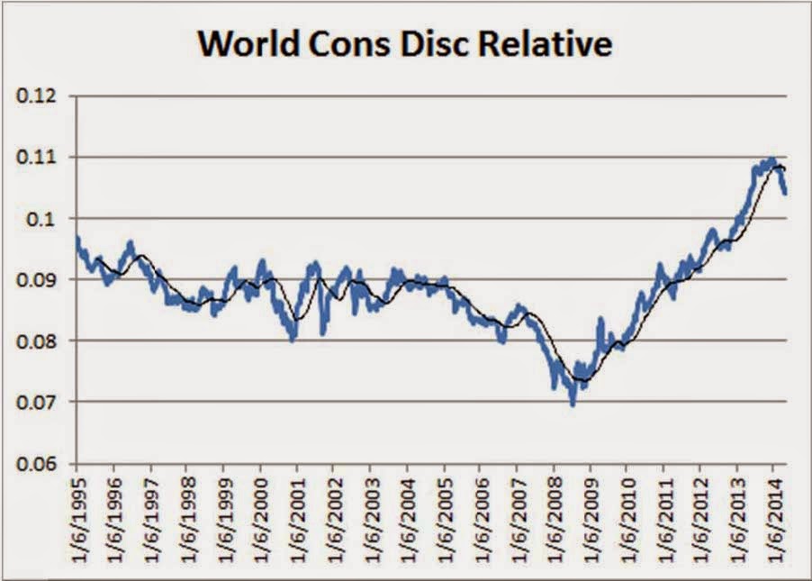
Since the beginning of the year, there have been a number of changes taking place underneath the surface of the market. We like to glance at the global sector relative strength charts regularly to get a visual on these changes and general sector performance over time relative to the MSCI World. These simple relative strength charts often tell some interesting stories.
Let’s run quickly through some of the standout shifts in the below charts:
- Consumer Discretionary, a big outperformer off the 2009 lows and a big outperformer last year, has broken down meaningfully versus the broader market. The sector has experienced the first significant break of the 30-week moving average since the ‘06/’07 rollover. Consumer Staples names began breaking down last year.
- The hook upward for utilities, not to mention the longer-term chart for Utilities, mirrors the Consumer Discretionary chart. The Utilities sector happens to be the best performing sector year-to-date. Is this a sign of the apocalypse? Not necessarily. Just because Utilities are trending higher and Consumer Discretionary is trending lower doesn’t mean markets are ready to dive into dark places. Last decade, the Utilities sector began a long period of sustained outperformance in early 2004, while the Consumer Discretionary downshift occurred around the same time. Markets continued to rise for another three and a half or four years.
- Energy and Materials are showing signs of life after a tough stretch. Energy has underperformed since early 2009. Materials names have been underwhelming for the past three years.
- Global Financials have remained yucky. At best, the Financial space has matched market performance over the past five years. One of these days, the sector will have another run of outperformance. Right now, they continue to have a hard time finding breakout velocity versus the broader market.
- Global Information Technology captures the investing public’s imagination and captures more headlines than less exciting areas of the market. Yet, we see that coming off the big boom and bust in the late 1990s and early 2000s, IT has basically followed the broader market relative performance-wise. The past four or five years have shown the same pattern. Meanwhile, the Telecom space has also been a very, very tough place to find relative performance since the bust over a decade ago.
- Health Care has chugged along quite nicely over the past three years. There was some movement downward for HC during Q1, but the sector has recovered of late. While there haven’t been any major trendline breakdowns here, this is a sector to watch. During the back half of last decade’s market uptrend, HC demonstrated relative underperformance.
- Industrials names have provided a mixed bag in recent years, though they’ve acted better of late.
- Overall, the picture seems to be of a market that is shifting into a more mature, “mid-innings” phase. Again, in 2004/2005, the middle of the last upward cycle, the Consumer oriented sectors and Health Care began underperforming while boring “stuff” like energy, materials, and utilities began exhibiting strength. We seem to be seeing signs of a similar shift this go-round. The shift wasn’t a death-knell for the overall markets then. We don’t believe that massive market disruption is in the cards right now either. The above sector shifts fit in well with some of the other work we’ve presented on this blog during the past several months indicating that global markets could be moving towards a period of solid, not spectacular, maybe a bit frustrating returns over the next few years. Looking forward, will IT, Telecom, and Financials break out of their relative strength doldrums?


