Friday, June 27, 2014

The VIX and Company Risk

Keeping with a few recent posts dealing with volatility and the market’s overall opinion on market stress, we thought it might be interesting to examine the connection between equity market volatility and market participants’ ideas on corporate risk.  

The VIX, an index that quantifies the market’s views on forward 30-day volatility, has historically been very closely related statistically to past/recent realized market volatility.  In other words, the levels of recent market volatility heavily color the market’s view of volatility in the near future.  This makes sense.  There’s a strong amount of “recency bias” among investors.  Taking the view on market volatility one step further, though, shows that percentage changes in the VIX are significantly correlated to percentage movements in Markit’s 5-year Investment Grade Generic CDX Index, which measures credit default swap prices for 125 investment grade companies across all sectors.  Higher levels in the CDX index show that the cost to insure against bond defaults in these companies is rising, meaning that the market’s view on corporate risk is increasing.  Lower levels in the index show that the market is less worried about corporate risk.  The VIX/CDX relationship is interesting, and shows the direct connection between individual company risk (or perceived risk) and overall market jitters.  

Here is a chart going back to the beginning of 2006.  Values for the VIX and CDX indices have been normalized for comparability.

Sharp rises (declines) in the VIX have been accompanied by sharp rises (declines) in the CDX index over the past decade.  In percentage terms, the moves from peak to trough have been almost completely in sync.  Accordingly, the weekly correlation for the percentage co-movements in these indices is approximately 0.65.  

We’ve obviously gotten geeky here.  What does the above chart convey in our view?

  • As one would expect, stock market volatility is related to underlying corporate risk.
  • Just as the realized volatility and the overall VIX index have hit multi-year lows, the market’s view on corporate risk is falling to the lowest levels since 2007.
  • In 2007, the VIX and the CDX index began creeping higher nearly a year before global equity markets began experiencing significant convulsions.  
  • While there are no guarantees, we’ll surmise there will be a similar deterioration in market attitudes towards risk decently ahead of the next market snafu.  
  • We’ve seen this play out with deterioration in leading economic indicator indices over time.  Significant downward moves in the leading economic indicators have occurred well ahead of major market calamities.  Of note, the beginning of the move upward in the VIX and CDX indices in early 2007 coincided almost perfectly with signals from leading economic indicators that recession probabilities had increased significantly.  This makes intuitive sense that perceptions of corporate risk, and hence volatility, would increase with increased recession probabilities.  Because…What happens during recessions?  Earnings collapse and earnings volatility significantly increases.  In other words, corporate “risk” jumps through the roof.
  • Therefore, while corrections, sometimes very uncomfortable, come and go, we maintain our view that a major market calamity isn’t on the immediate horizon.  As with some of the other early warning indicators we’ve discussed such as financial market stress, until we see indicators like the CDX index begin to creep higher on a sustained basis in sympathy with recession warnings, we’ll stay involved in markets.  As seen above, the CDX index is still trending down.  And, despite a noisy and discouraging Q1 GDP print in the US, leading indicators here and abroad haven’t budged to the downside whatsoever.  The probability for recession over the next 8 to 12 months remains very low.  We’ll stay vigilant though!

Friday, June 13, 2014

Complacency

A few weeks ago, we discussed the very low levels of stress showing up in the various Federal Reserve and Conference Board financial system indicators.  Digging deeper and looking at some of the individual indicators of risk-tolerance and volatility out there in various markets produces some very interesting observations.  

Since we spend our time investing in the global equity markets, we’ll take our first quick look at volatility in the S&P 500 and the MSCI EAFE equity indices.  The charts below show that market volatility is back at multi-year lows, hence explaining why the VIX in the US is trading at multi-year low levels.  We use the standard deviation for the trailing 20 days of index performance.  In the S&P 500, realized volatility has reached the lowest sustained levels observed since early 2011.  The EAFE has achieved a much more significant milestone.  20-day volatility in the MSCI EAFE hasn’t been at these levels since May 1996!   

What happened the last time volatility got this low?  The 2011 episode, of course, morphed into a massive correction and spike in volatility in August of 2011 as the European financial crisis and S&P US debt downgrade crisis took hold.  In 1996, the EAFE subsequently corrected just south of 10%, with the correction low achieved in early 1997.  The market correction lasted nearly a year.  In both of those cases, markets eventually resumed strong upward trajectories.  Prior to 2011, the last sustained round of low volatility at these levels occurred in April 2007, just before the global financial crisis began brewing.  We don’t want to make any alarming market calls, especially since many of the other indicators we follow show a much better backdrop than the environment confronting markets in April 2007.  Nonetheless, we would not be surprised to see this market take a corrective breather in the near-term.  


Our next look comes from the world of high-yield bonds.  We like to look at the spread between the Bloomberg High-Yield Index and 10-year US Treasury yields.  When this spread is trending down and compressing, it’s an indication that flows into the riskier end of the debt pool are strong and, hence, risk tolerance is higher.  This week, the spread has compressed to the lowest level observed in our data series, which goes back to 2002.  Yes, depending on the indicator, high yield spreads have now equaled or eclipsed the levels observed in early 2007 on the downside.  The global chase for yield has certainly been a formidable force.  Anecdotes in the business press continue to pour out about the reemergence of cov-lite loans and PIK bonds and the like.  

Does this mean the world is about to come to an end?  Not necessarily.  As you can see below, during the last cycle, spreads first reached super compressed levels in late 2004 and stayed benign for approximately three years before the wheels came off the debt (and equity) markets and spreads spiked to record levels.  As we mentioned above when discussing equity volatility, the general indicators we like to use present a better backdrop than observed in early to mid 2007, when indicators were clearly showing recession probabilities were high and that long-term momentum was waning in various areas across the investment universe.  But, we’ll say again, we wouldn’t be surprised if there’s some sort of corrective activity in these markets to keep participants on their toes in the near future.
We’ve said on several occasions over the past year and a half that the overall intermediate-term market backdrop remains favorable worldwide, especially in overseas markets.  There’s nothing at present that materially changes our intermediate-term view.  However, corrections are a part of life in equity markets and other markets and serve to reset investor expectations in a healthy way.  Indicators like the ones above show that a reset may be in order in coming weeks and months to recalibrate risk markets that have become very complacent.  Of course, we’ll keep an eye on the longer-term trends.  If anything changes underneath the surface worthy of changing the intermediate-term outlook, we’ll certainly shout it from the rooftops.

Sunday, June 1, 2014

No Stress

With accommodative central bank policy feeding into low stock market volatility worldwide, tight corporate bond spreads, and other indications that financial market worries remain at low levels (such as report this week in the Wall St. Journal that home equity loans are becoming popular again), we thought it would be interesting to capture where current financial conditions stand in a single, clean indicator.  

As such, we used three financial system stress indices produced by various Federal Reserve branches in combination with the Conference Board’s Leading Credit Indicators Index to produce a single indicator showing that, indeed, we’re observing a period of accommodation and low financial stress that rivals the go-go financial system days of the mid-2000s.  

Quickly, how did we construct our index?  We took the 4-month moving averages for the St. Louis Fed Financial Stress, Kansas City Fed Financial Stress, Chicago Fed National Financial Condition, and Conference Board indices going back to 1994.  Then, we calculated the Z-scores (standard deviations away from average) for the 4-month moving averages in each of the indices.  Finally, we averaged those z-scores across the four indicators to produce the final indicator.  

How do organizations like the Federal Reserve Banks and Conference Board construct financial system indices?  The Conference Board, for instance, uses a variety of financial market indicators such as swap spreads, the TED spread, margin and debit balances, and national bank loan surveys to construct their index.  The Chicago Fed uses 105 different financial market indicators to construct an index, many relating to loan surveys and various interest rate and swap spreads as well.  

Here is a visual representation of the work:


As you can see financial system stress remained below average through the mid-1990s until the time of the Asian/Russian/LTCM financial crises drove financial system stress higher.  Stress remained elevated through the market turmoil and recession from 2000 to 2002.  Coming out of the early 2000s recession, financial stress declined markedly, reaching a bottom in 2005 at approximately the same time the real estate boom was nearing a peak and central bankers in the US started talking about the so-called “global savings glut.”  Stresses started to increase dramatically in mid-2007 as the markets glimpsed the first signs that the leveraged financial products markets associated with the housing boom were beginning to crack.  As the worst financial crisis since the Great Depression unfolded, we see a dramatic spike in system problems.  The highest level of stress in our indicator was reached in December 2008 near the very height of the Great Recession.  Coordinated global central bank actions pulled us back from the brink through 2009 and financial system conditions have continued to improve since then, except for a few spikes associated with the European turmoil during 2010 and 2011.  Interestingly, the lowest level ever recorded in this index occurred in February of this year.  The index isn’t far removed from those lows; financial conditions remain very accommodative.  

What are some takeaways from looking at this data?  

Over the past 20 years, the two big equity market downturns in the US and globally happened several months to a couple of years after these financial stress indices began showing bottlenecks in the system and spiked higher, well above zero.  Looking at the current market situation, while this isn’t a primary indicator we use to drive risk allocations, we think this meets up with other indicators that we use showing that the risk for a major market calamity are reasonably low at present, even though long-term valuations in the US are somewhat stretched.  For instance, leading economic indicators here and abroad show the risk of recession over the coming year remains very low.  And, general longer-term market technical indicators remain favorable.  Until we see indicators like this begin to grind noticeably higher and above the zero-line, we’ll remain sanguine about the intermediate-term path of equity market prices.  


That said, the contrarian gremlin in us notes the extreme low stress level in this index will have to unwind at some point.  Looking across markets and asset classes, it’s hard for us to see, for instance, how high-yield corporate debt spreads could get much tighter.  Granted, this index remained at extremely low levels for three or four years ahead of the Great Recession.  When benign conditions unraveled, however, the unprecedented long period of calm morphed into an unprecedented period of stress.  Just as risk and reward can be symmetrical when looking at equity markets, there’s a symmetry to indicators like this.  Big deviations to the downside tend to lead eventually to big deviations on the upside.  We’ll certainly keep an eye on this and other market indicators for signs that trends are changing.

Monday, May 19, 2014

Some Alternate Views

Greetings from Memphis in May BBQ Fest!  As we try to cut through the pork-induced food fog, we figured it might be interesting to check in on a few charts showing some trends that might provide some different perspective on recent and future market moves.

First, we want to take a quick look below at the historical S&P 500 price relative to spot Gold.  We see this chart from time to time among various pundits and analysts.  The interesting aspect of this chart over the past year or so is the significant trend change that has taken place.  When the ratio moves higher, S&P 500 prices are outpacing Gold, and vice versa.  We have the ratio’s 200-week moving average represented on the chart.  As you can see, going back to the late 1970’s, major movements through the 200-week moving average have coincided with major, long-term turns in the secular bull/bear equity market trend.  For instance, the ratio moved solidly through the moving average in 1982/1983 just as the market began a nearly 20 year run towards highs in 2000.  Conversely, this ratio broke down through the 200-week in early 2001 just as the decade long secular bear in equities was beginning to take hold (with Gold moving in the opposite direction, ever upward).

Lo and behold, the ratio made a decisive break higher through the 200-week at the beginning of 2013.   The 200-week moving average is moving higher for the first time since the last bull run.  We don’t want to make a decisive call that a 15 to 20 year secular bull is on the way, but it does show us that market dynamics and attitudes have changed in an eye-opening way.  Though sentiment surveys still show healthy skepticism towards equities, in practice markets have become much more comfortable with risk and more skeptical of safety trades.
Next, we’ll keep Gold prices in the equation by showing Gold price relative to the trade-weighted dollar index.  Once again, we see another significant shift through the 200- week moving average after a massive move higher over the past decade.  Like the ratio above with the S&P 500, this ratio burst out to the upside in the early 2000s, but has tumbled downward over the past year and a half as gold tumbled and the trade-weighted dollar showed strength, confounding many prognosticators.  Perhaps this trend shift after such a long run higher means that, intermediate-term, calls for the death of a dollar-based global financial system are premature?  
Moving back to equities, another interesting perspective below is the so-called Fed Model.  This model shows the relationship between earnings yield (the inverse of P/E: the lower the P/E ratio, the higher the earnings yield) and long-term Treasury yields.  Theoretically, higher levels in the ratio indicate an undervalued equity market and vice versa.  We’re very aware that the traditional Fed model has performed very poorly from a predictive market-timing standpoint.  Most Fed Model representations use trailing 12-month P/E, which can be quite volatile, especially during major shifts in the earnings cycle.  We’ve substituted the Shiller 10-year CAPE P/E in place of trailing 12-month to provide more stability to the indicator.  

As you can see, extreme movements above or below the +1/-1 standard deviation band have been associated with market lows and highs since the early 1960s.  For instance, the move above the 1 standard deviation band in mid-1962 marked the beginning of a equity market run into the late 1960s during which the S&P 500 doubled in price.  A similar spike in 1974 marked the bottom (though not the absolute end) of the 70s secular bear market.  Markets moved meaningfully higher off those ’74 lows.  Fast-forward and the move below the bottom of the band in the late 1990s coincided with the end of the massive 80s/90s bull run.  Look at the amazing moves above the band in financial crisis and post-crisis months and years.  Combine a devastating equity market selloff and P/E compression cycle with super-low Treasury yields, and you get moves several standard deviations above the norm. Even with the substantial equity market move higher since 2009, the ratio is just now approaching the top portion of the standard deviation band.

Of course this situation could play out several different ways if we assume that the ratio will eventually work its way back into more normal territory.  For instance, Treasury yields could spike higher while equities remained neutral.  Equity markets could continue to move higher while Treasury yields did the same.  Or, equities could continue to move ever higher (P/E expansion) while Treasuries continue to meander around current levels.  Whatever happens, the chart tells us a few things.  First, we get a great visual representation of the strange market distortions that played out during and after the financial crisis.  Second, looking at the various scenarios, it’s not a major stretch to argue that equity prices could continue to defy the skeptics and move higher via multiple expansion channels.
We’ve also produced an alternate take to this model using corporate investment grade yields instead of Treasuries.  Just like the more traditional Fed Model above, we get a similar picture.  Equities seem to be in a favorable position relative to investment grade debt.  
Is there a thread or theme unfolding through these alternate-view charts?  If anything, we just might be able to draw the conclusion that equity markets could continue to defy the widely held view that the upward trend is significantly long in the tooth.  After all, we think there is a lot of truth to the statement put forward by several of the bloggers and analysts we follow that this is the “most hated bull market in history.”  Trend changes over the past few years in the direction of a risk-on trade are powerful.  Meanwhile, Fed and corporate bond model charts show that one can make a case that equities remain undervalued vis a vis various fixed income instruments.  We know from our work following various sentiment indicators that sentiment among investors remains tilted towards the pessimistic side long-term, favorable for markets from a contrarian standpoint.  Certainly, there are distortions in these charts related to the Fed’s extraordinary help over the past five years.  At some point, though, we have to look beyond Fed-only explanations.  


Friday, May 9, 2014

The Great Small-Cap Freak Out

If you haven’t heard, it’s been a tough year for small-cap stocks here and abroad.  YTD, the Russell 2000 is down over 5% and the MSCI World Small Cap Index is trailing the broader index.  Both indices are down strongly since early March.  The Russell 2000 has fallen approximately 9% and its international cousin has fallen approximately 4% over the past two months.

In our hypersensitive media environment, this of course has invited a number of breathless shotgun reactions as to what this means for markets moving forward.  A popular conclusion among many pundits centers on the story that the breakdown of small-cap indices relative to the broader indices is a massively negative early warning signal for a major market correction or collapse.  In reality, the historical record couldn’t be more different.  Looking back at the historical relationship between the Russell 2000 and the S&P 500 (we’ll go with these US indices because they have longer track records), cycle changes back towards large-cap outperformance have actually coincided with bull market activity.  

Don’t get us wrong, as we’ve mentioned on these pages before, the S&P 500 is overvalued based on several long-term valuation metrics we like to follow.  A US market correction could certainly pop up at any point, and would be a normal part of participating in the equity markets.  Looking at the relationship between small-caps and large-caps, however, it’s hard for us to accept the conclusion that the Russell 2000 breakdown of late is the end-all-be-all canary in the coalmine.

Here’s the chart going back to 1978 on Russell relative strength vis-a-vis the S&P 500.  The black band represents the +/- 1 standard deviation band around the long-term average.  


As we can see above, the Russell 2000 has experienced a sustained period of outperformance since the end of the 1990s.  This, in turn, followed a 20-year secular downward trend that began in the early 1980s.  What’s interesting about this?  The last time the Russell/SPX relative strength chart peeked its head above the +1 standard deviation bar and reversed (beginning the long secular small-cap underperformance trend through the 80s and 90s), the broader US markets were beginning 20-year secular bull market.  Conversely, the major trend-reversal towards small-cap outperformance that took place in the late 1990s happened to coincide with the beginning of terribly frustrating secular bear market that was in place from 2000 onward.  These trends contradict the conclusions out there that small-cap underperformance means major trouble in the near or intermediate term.   We’re definitely not making a prediction that this we’re in the beginning stages of a multi-decade secular bull market.  But, we think relying on small-cap stock index reversals as a warning indicator for broad market activity is misguided based on the record over the past 35 to 40 years.

So, what explains the reversal in small-caps?  The answer is very simple.  After approximately 15 years of sustained outperformance, small-cap stocks have become very expensive relative to their large-cap compatriots.  Matter of fact, they’ve become historically overvalued on a relative basis.  As of this week, the Russell 2000 is trading at 16x on an EV/EBITDA basis vs. 10.6x for the S&P 500.  We’ve looked at the ratio of the Russell valuation to the S&P 500 valuation over time.  That ratio is currently 1.5, slightly off the all time peak of 1.53 observed a few weeks ago.  Historically, the average ratio between the two multiples is 1.05.  The median is 1.05 as well.  Standard deviation for the weekly data going back to 1978 is approximately 0.145.  Therefore, the ratio of the Russell EV/EBITDA multiple to the S&P 500 multiple is currently a whopping 3.1 standard deviations above the norm.  This is a big, big outlier, which suggests that small-caps could and should be relative underperformers for a while.  If we use EV to Sales multiples, we see a similar picture.  The relationship is over 2 standard deviations above the norm.  


Therefore, we believe it’s premature to flip-out about the small-cap breakdown of late.  As shown, over the past four decades, Russell underperformance has actually coincided with broader secular bull performance.  Whatever the situation, the bigger story seems to be that if you have all your eggs in the small-cap basket, it may be time to start heading back towards the larger-cap space.  These secular shifts between small and large cap seem to take place every 15 to 20 years.  It looks like we could be on the cusp of one of those major shifts.  It doesn’t mean the end of the world is at hand.

Friday, May 2, 2014

Relative Strength Overview

Since the beginning of the year, there have been a number of changes taking place underneath the surface of the market.  We like to glance at the global sector relative strength charts regularly to get a visual on these changes and general sector performance over time relative to the MSCI World.  These simple relative strength charts often tell some interesting stories.   

Let’s run quickly through some of the standout shifts in the below charts:

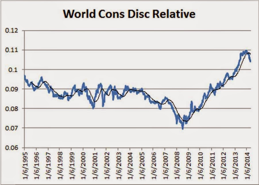
  • Consumer Discretionary, a big outperformer off the 2009 lows and a big outperformer last year, has broken down meaningfully versus the broader market.  The sector has experienced the first significant break of the 30-week moving average since the ‘06/’07 rollover.  Consumer Staples names began breaking down last year.  
  • The hook upward for utilities, not to mention the longer-term chart for Utilities, mirrors the Consumer Discretionary chart.  The Utilities sector happens to be the best performing sector year-to-date.  Is this a sign of the apocalypse?  Not necessarily.  Just because Utilities are trending higher and Consumer Discretionary is trending lower doesn’t mean markets are ready to dive into dark places.  Last decade, the Utilities sector began a long period of sustained outperformance in early 2004, while the Consumer Discretionary downshift occurred around the same time.  Markets continued to rise for another three and a half or four years.     
  • Energy and Materials are showing signs of life after a tough stretch.  Energy has underperformed since early 2009.  Materials names have been underwhelming for the past three years.  
  • Global Financials have remained yucky.  At best, the Financial space has matched market performance over the past five years.  One of these days, the sector will have another run of outperformance.  Right now, they continue to have a hard time finding breakout velocity versus the broader market.
  • Global Information Technology captures the investing public’s imagination and captures more headlines than less exciting areas of the market.  Yet, we see that coming off the big boom and bust in the late 1990s and early 2000s, IT has basically followed the broader market relative performance-wise.  The past four or five years have shown the same pattern.  Meanwhile, the Telecom space has also been a very, very tough place to find relative performance since the bust over a decade ago.
  • Health Care has chugged along quite nicely over the past three years.  There was some movement downward for HC during Q1, but the sector has recovered of late.  While there haven’t been any major trendline breakdowns here, this is a sector to watch.  During the back half of last decade’s market uptrend, HC demonstrated relative underperformance.
  • Industrials names have provided a mixed bag in recent years, though they’ve acted better of late.
  • Overall, the picture seems to be of a market that is shifting into a more mature, “mid-innings” phase.  Again, in 2004/2005, the middle of the last upward cycle, the Consumer oriented sectors and Health Care began underperforming while boring “stuff” like energy, materials, and utilities began exhibiting strength.  We seem to be seeing signs of a similar shift this go-round.  The shift wasn’t a death-knell for the overall markets then.  We don’t believe that massive market disruption is in the cards right now either.  The above sector shifts fit in well with some of the other work we’ve presented on this blog during the past several months indicating that global markets could be moving towards a period of solid, not spectacular, maybe a bit frustrating returns over the next few years.  Looking forward, will IT, Telecom, and Financials break out of their relative strength doldrums?


Friday, April 25, 2014

Round and Round

As of today’s close, the S&P 500 is up 0.81% on a simple price basis.  Except for the late January correction and subsequent rally, this has been the quintessential “dog chasing its tail” type market year to date.  

While there are three trading days left in April, and anything can happen of course, we thought it might be interesting to see what has happened in the past when the S&P 500 has finished the first third of the year near flattish levels.  Why the first third?  Nearly everyone focuses on quarterly data.  Why not look at sometime a little different.  And, April leads into May, the beginning of a historically week seasonal period.  Remember, we should all sell in May and Go Away.  April just might be a good spot on the calendar to evaluate performance dynamics.  

We looked back over the past 83 years of S&P data and learned a few things.  First, it’s somewhat rare for the S&P 500 to finish the first third of the year near the zero line.  There have been only 14 instances over the past 83 years where the S&P 500 finished within a +2% to -2% range over the first four months.  Second, there’ve only been five instances where the market has finished the first third of the year between 0% and +2%, the range that pertains to this year’s market.  

So, what happens the rest of the year when the market starts off flattish?  

Looking at the 14 overall instances where the market has begun the year within + or – 2% of the zero line, there are frankly no solid conclusions to draw from the data.  Average total year returns for those years is -1.15% and median performance is 2.76%.  However, the standard deviation of yearly returns is a whopping 17.6%.  Full-year returns ranged from +25.8% to -47.1%.  

Keep in mind, though, that 9 out of the 14 yearly results during the first third fell between 0% and -2%.  In those nine years, average full year returns were -5% and median full year returns were negative 10.1%, with a standard deviation of 20.9%.

Focusing on the 5 years that ended the first third between 0% and +2%, the picture is more encouraging, though we’ll admit that 5 occurrences is far from meeting the standard of statistical significance.  Average full year returns for the five year: 5.8%.  Full year median returns come in at 7.1%.  The standard deviation is a much tighter 5.8%.  All in all, this presents a much better picture than the volatile, negative stats above.  Four out of the five years that finished the first third of the year between 0% and +2% closed out the full year in positive territory.


Are there any conclusions to draw?  As mentioned, statistical significance is lagging.  And the overall data is all over the place.  But, if we had to choose, we’d err on the side of hoping that the S&P 500 can finish April on the positive side of zero.  Many have struggled to explain the January effect through the years. Maybe, this situation is similar.  There’s no rational reason why the market should behave markedly different the rest of the year based on the fact that the market happens to be slightly on one side or the other of zero.  Yet, looking at the past numbers, if April can close around these levels, just on the right side of zero, it will fit in with our expectations from other statistical research that 2014 should be a modest but OK year.  A negative close to the month may, rationally or irrationally, open markets up to a volatile and frustrating final nine months.